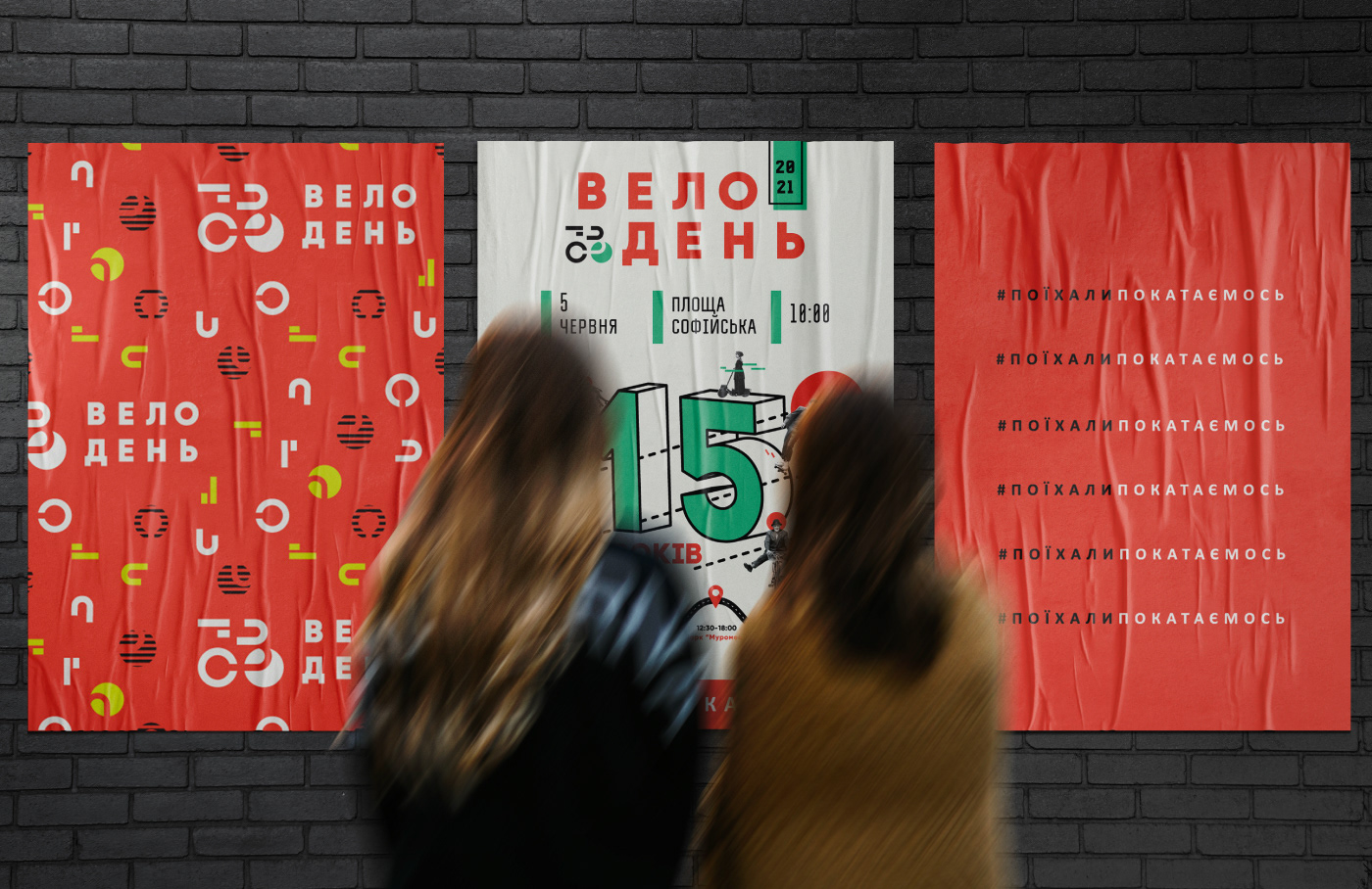
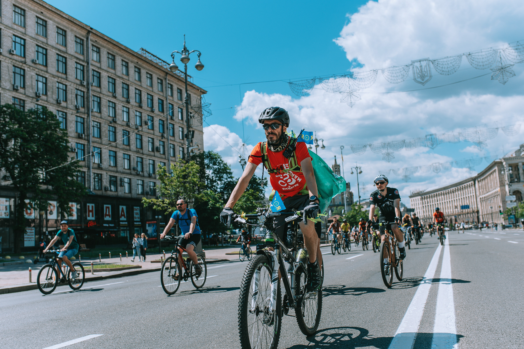
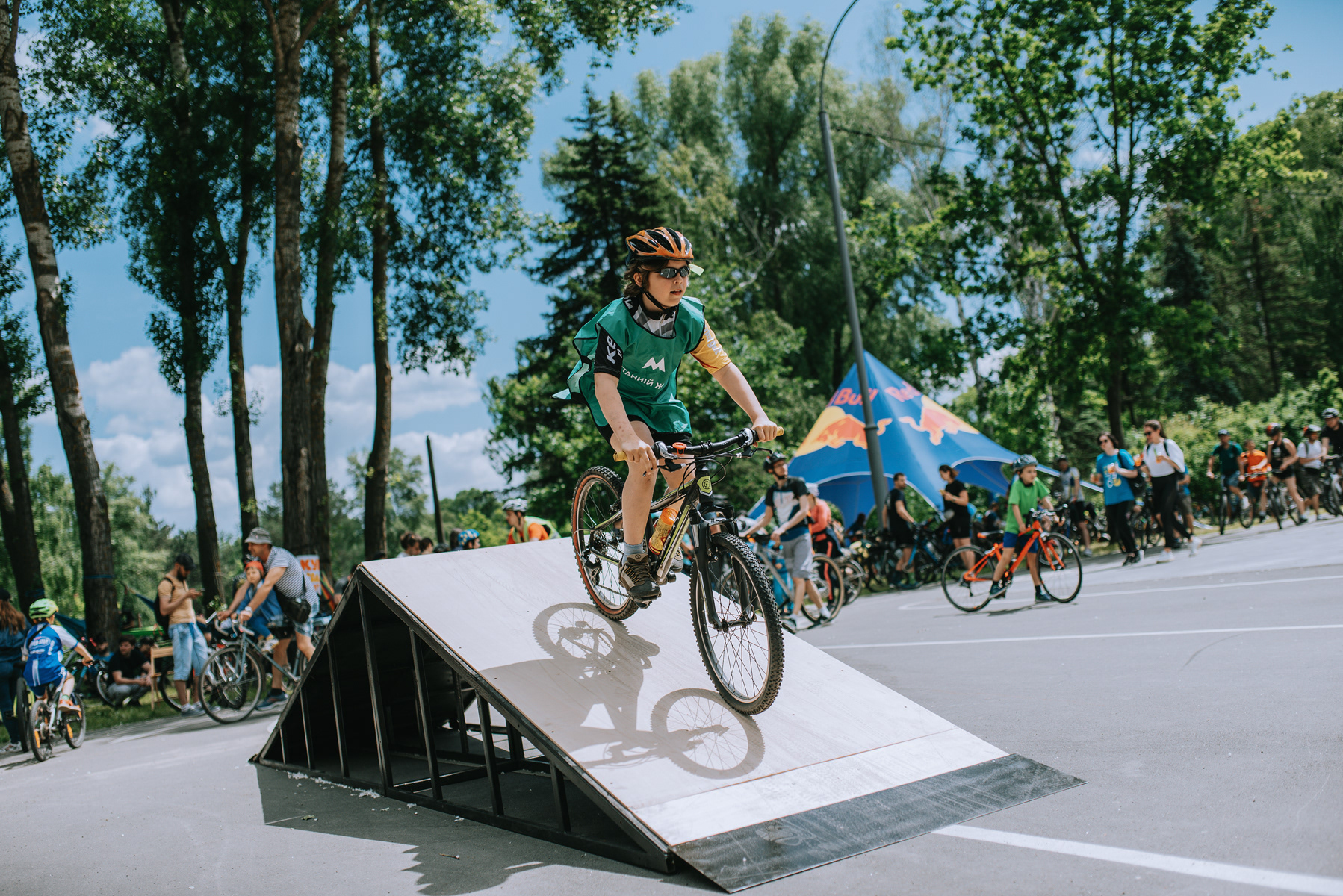
Bikeday is an urban festival dedicated to cycling culture, active lifestyle and community. The goal of the project was to create a cohesive visual identity that could work across both digital and physical environments of the event.
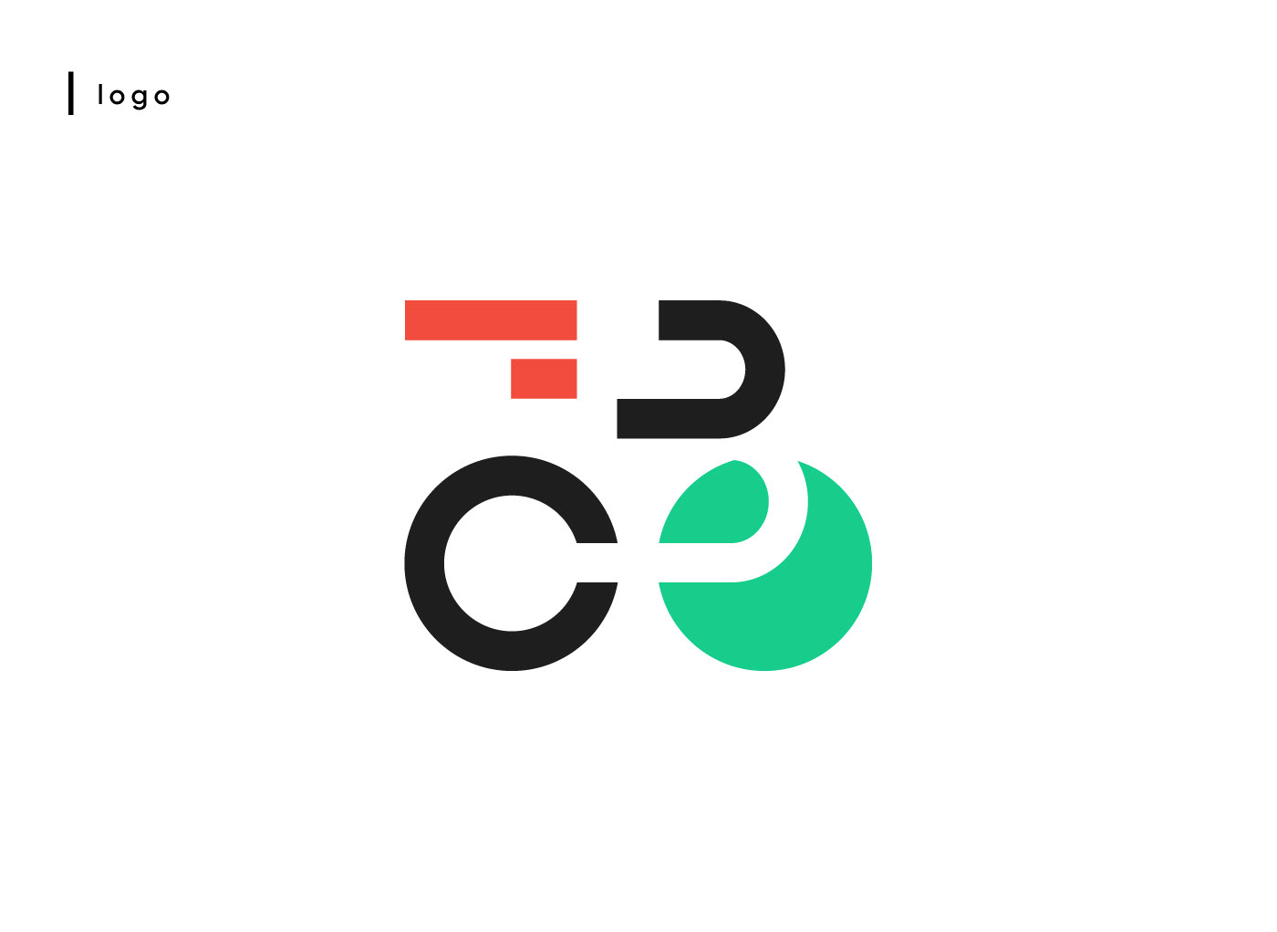
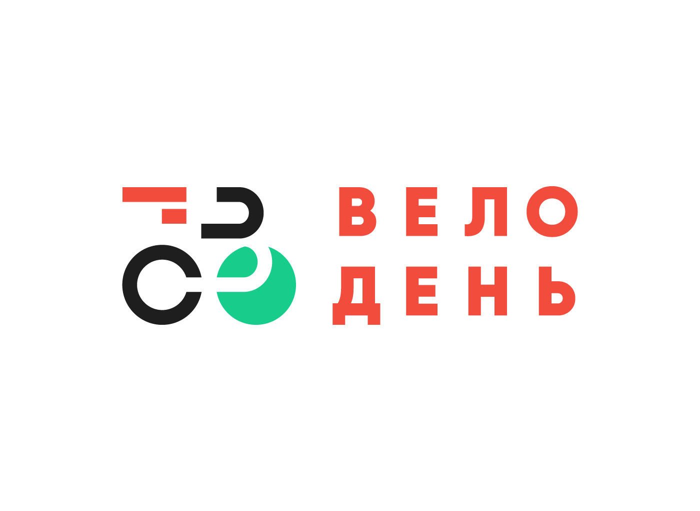
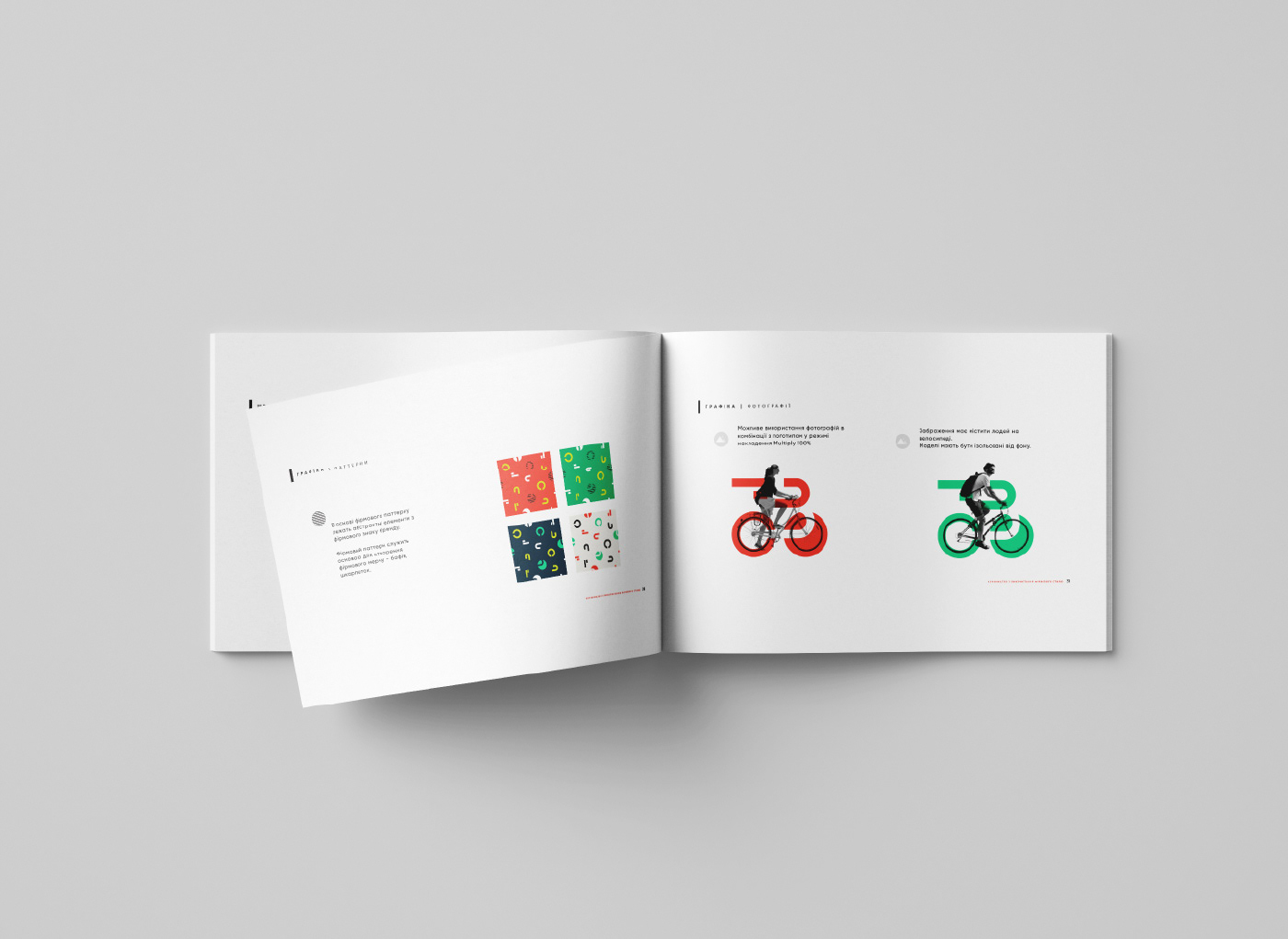
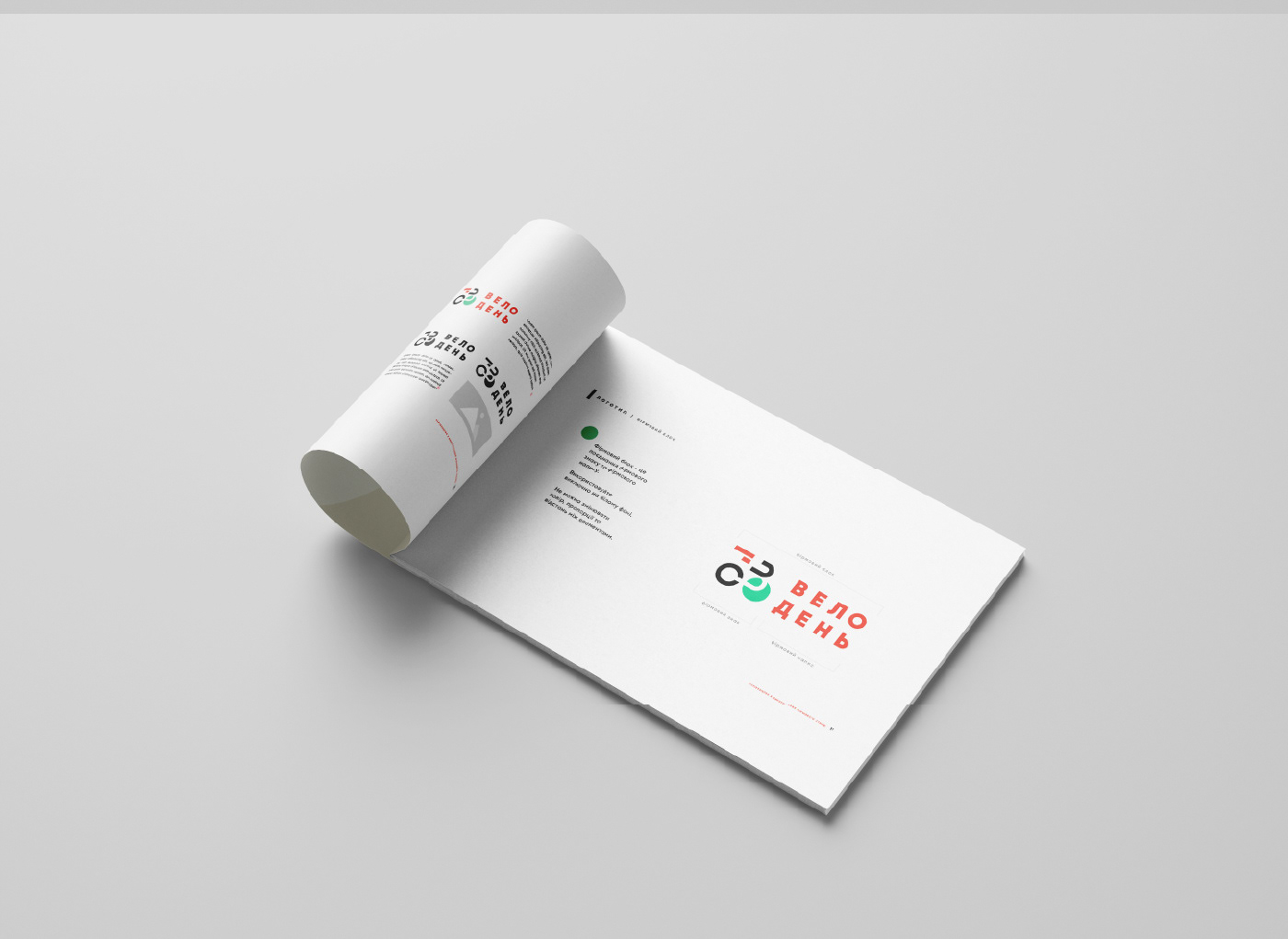
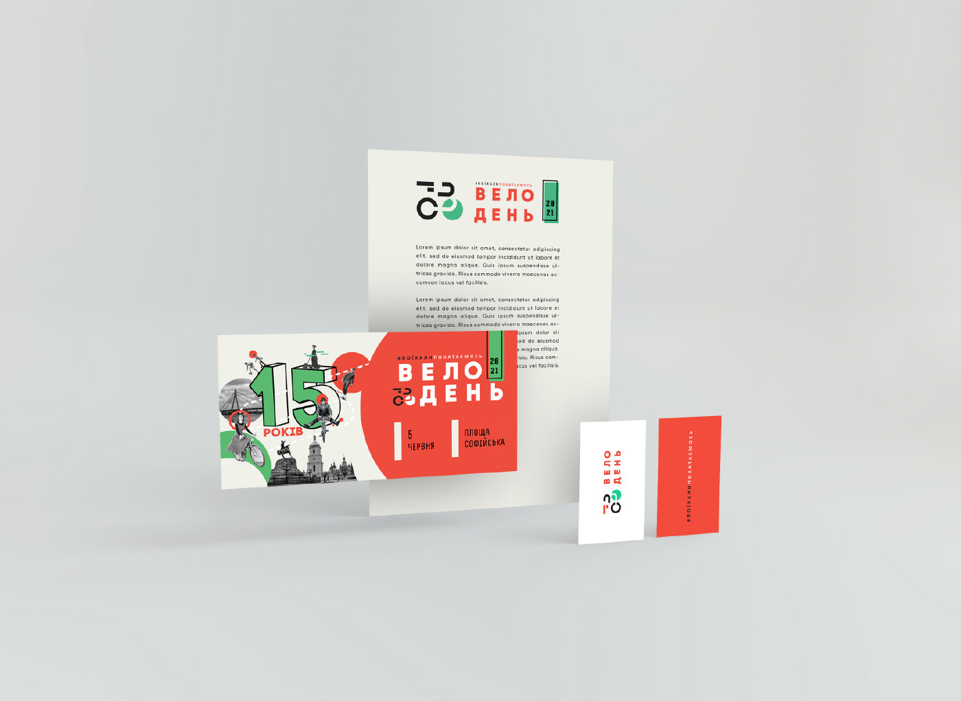
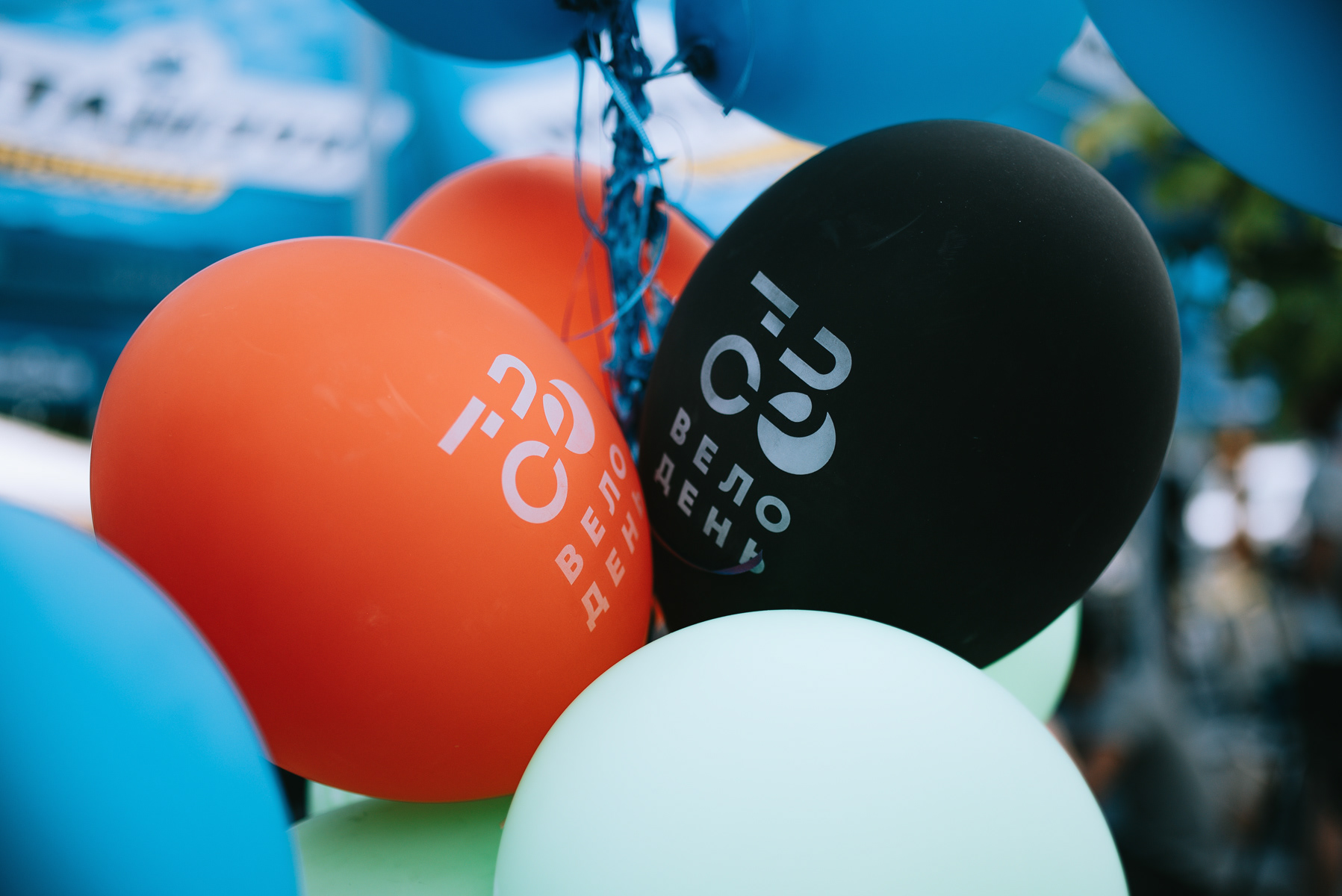
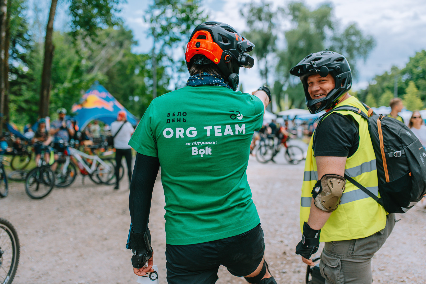
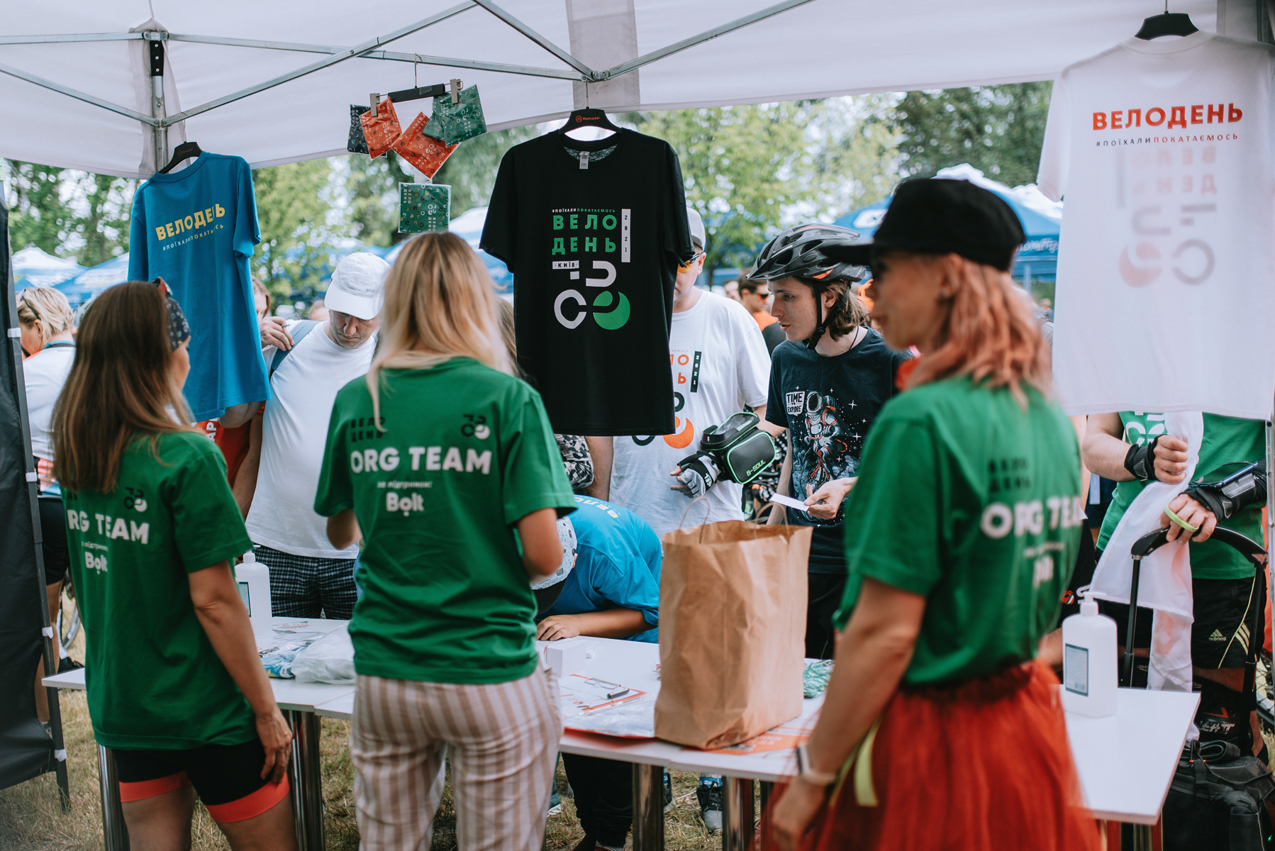
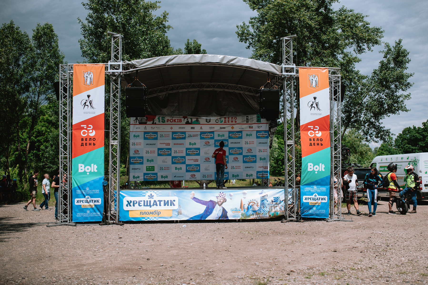
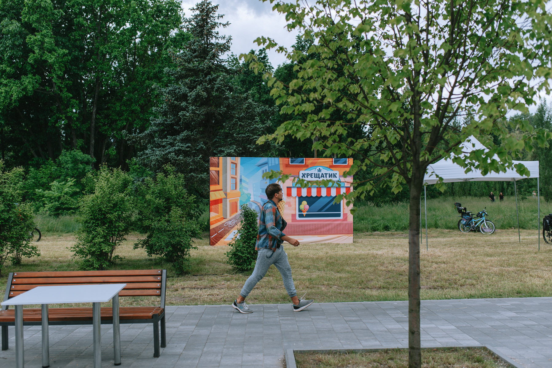
The project included a complete rebranding of the festival: redesigning the logo, developing the key visual and creating a flexible visual system that could be applied to various formats.
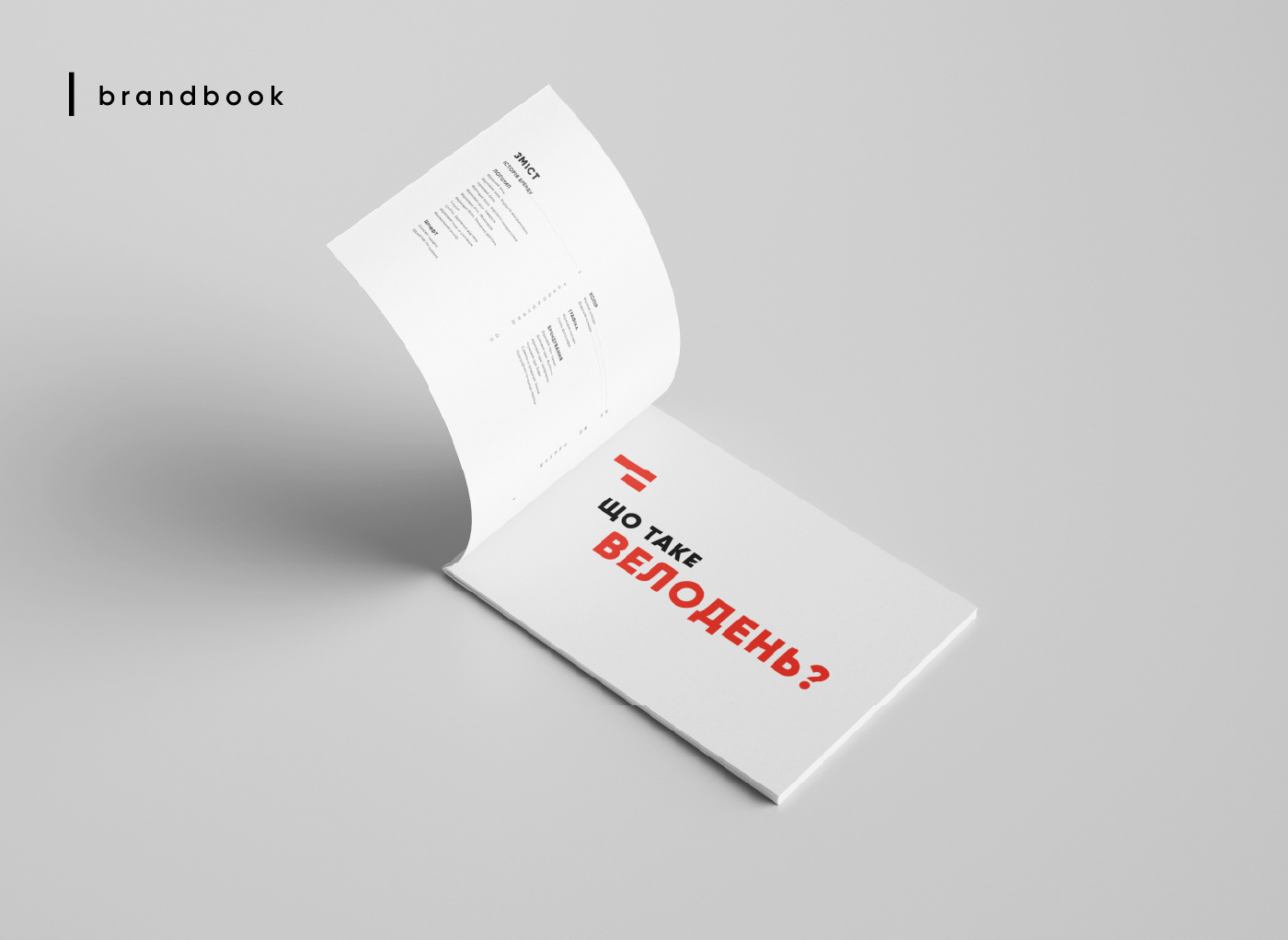
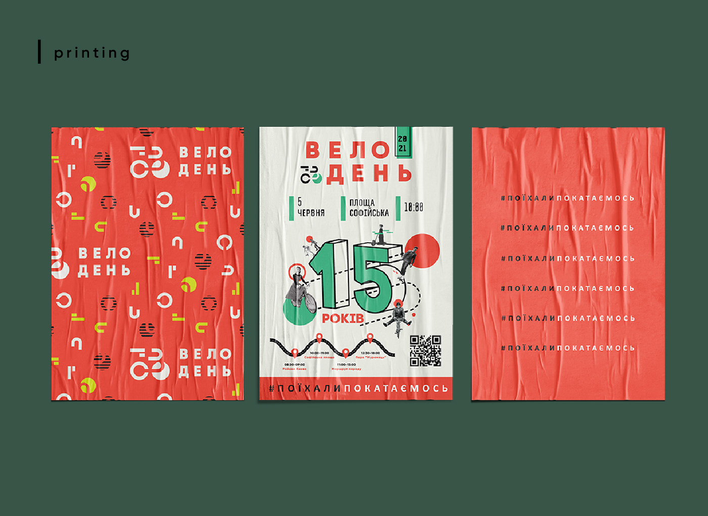
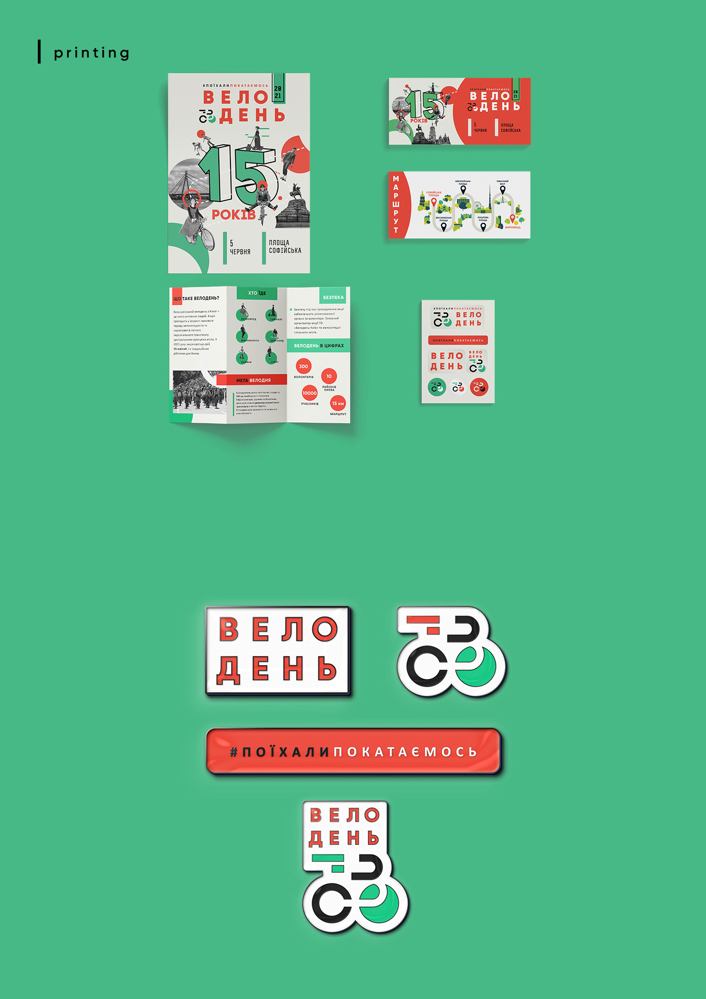
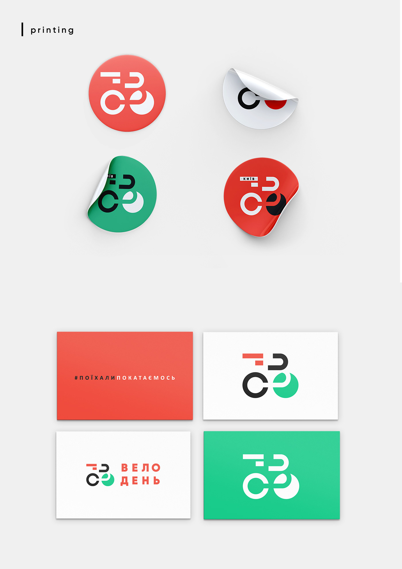
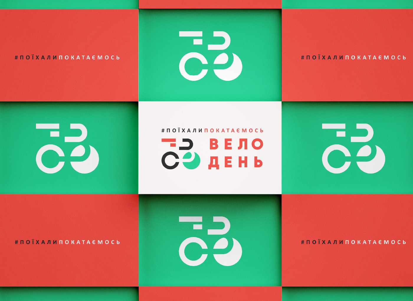
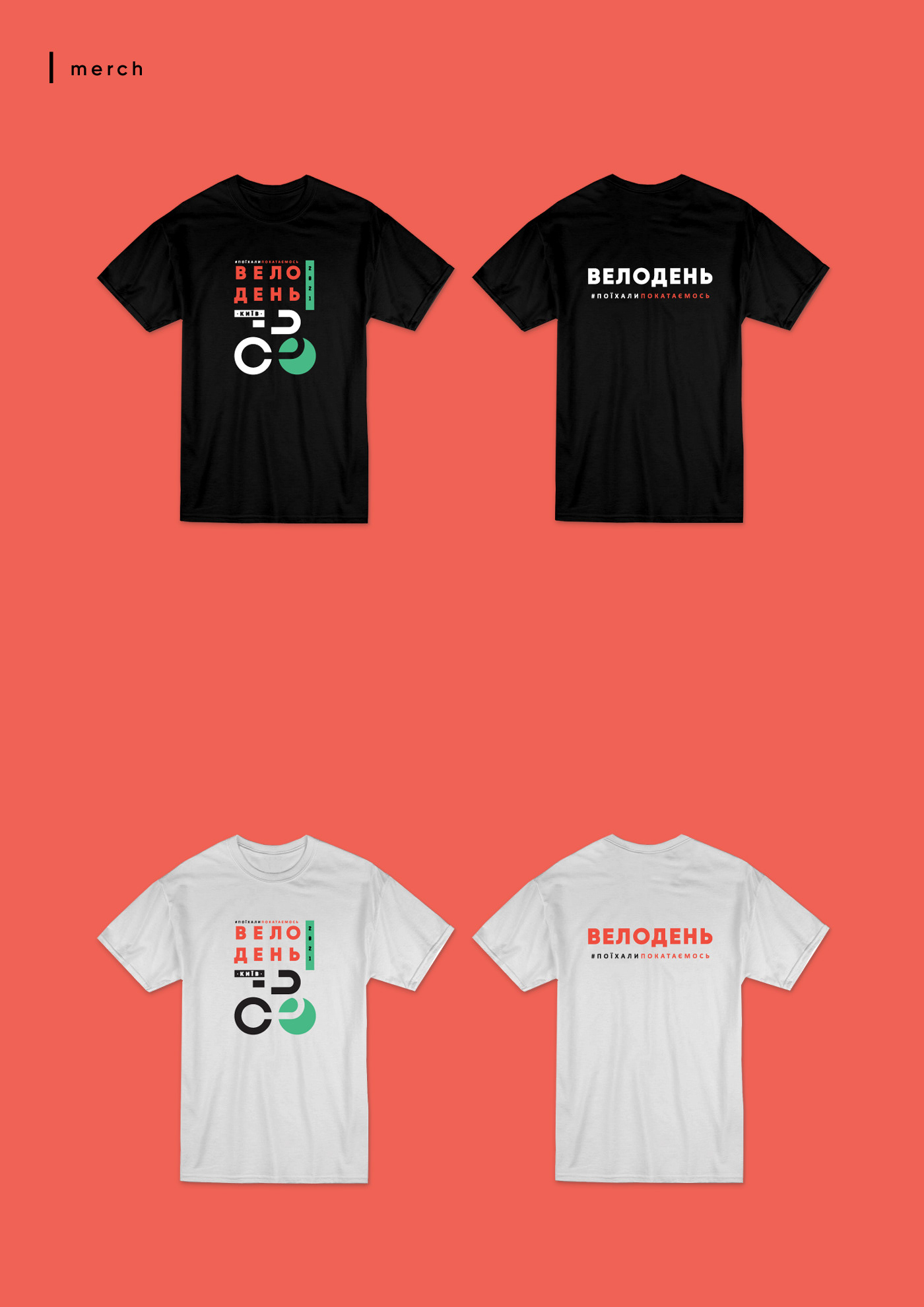
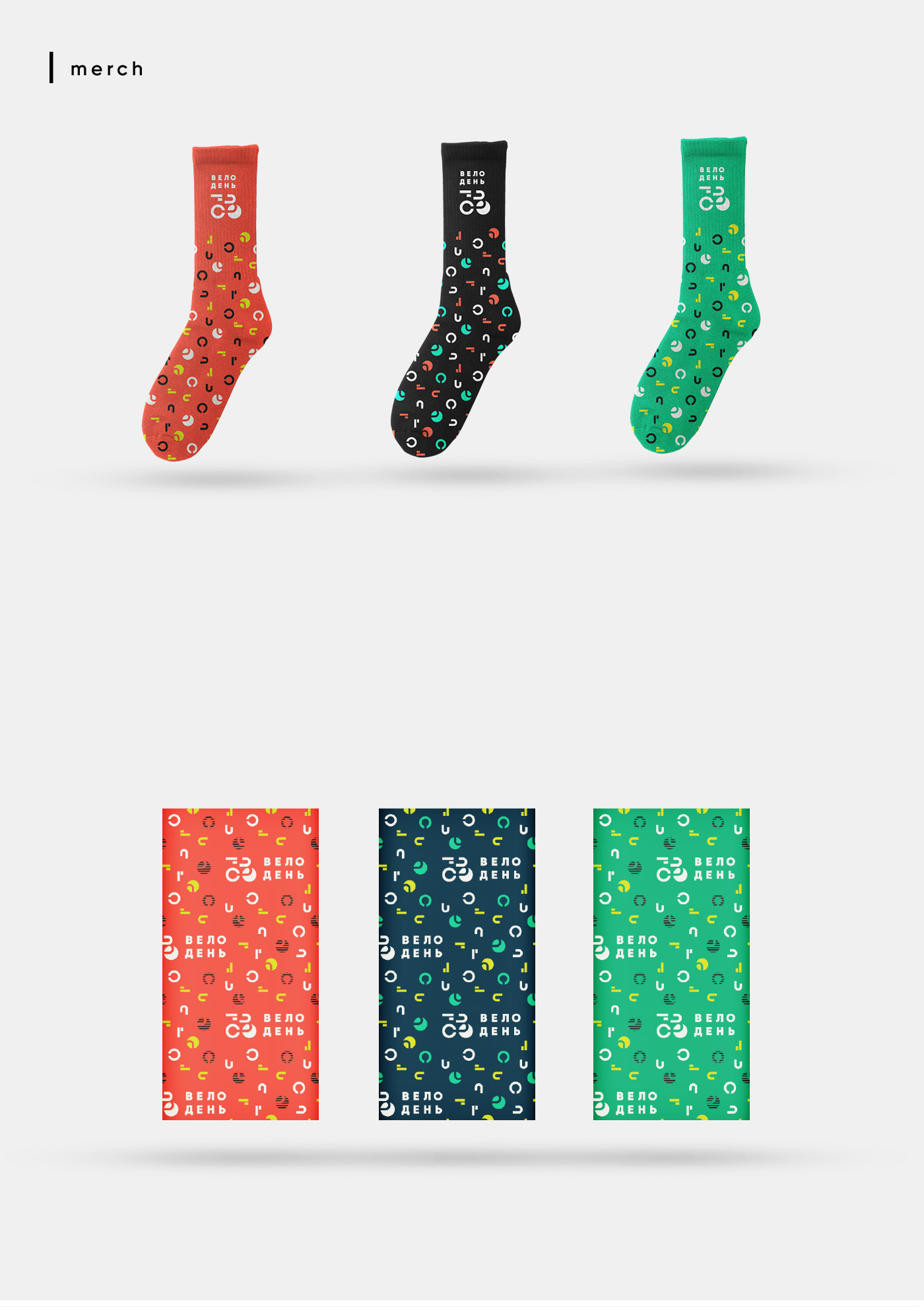
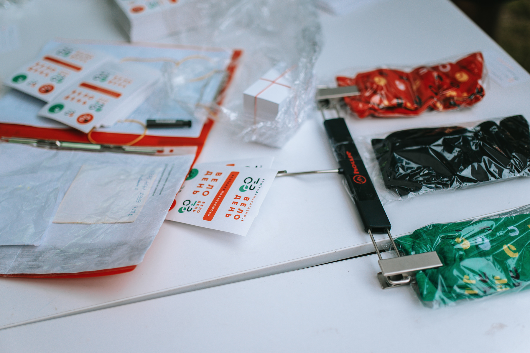
As part of the project, I designed a wide range of materials including:
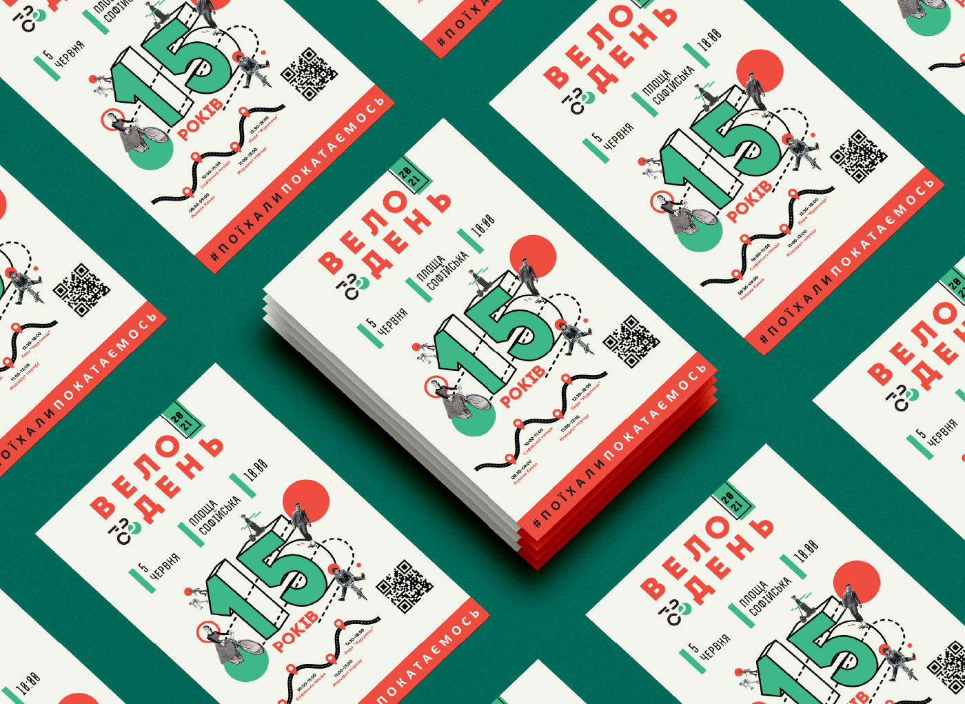
• festival posters, flyers and banners
• printed materials and promotional graphics
• social media visuals used for event promotion
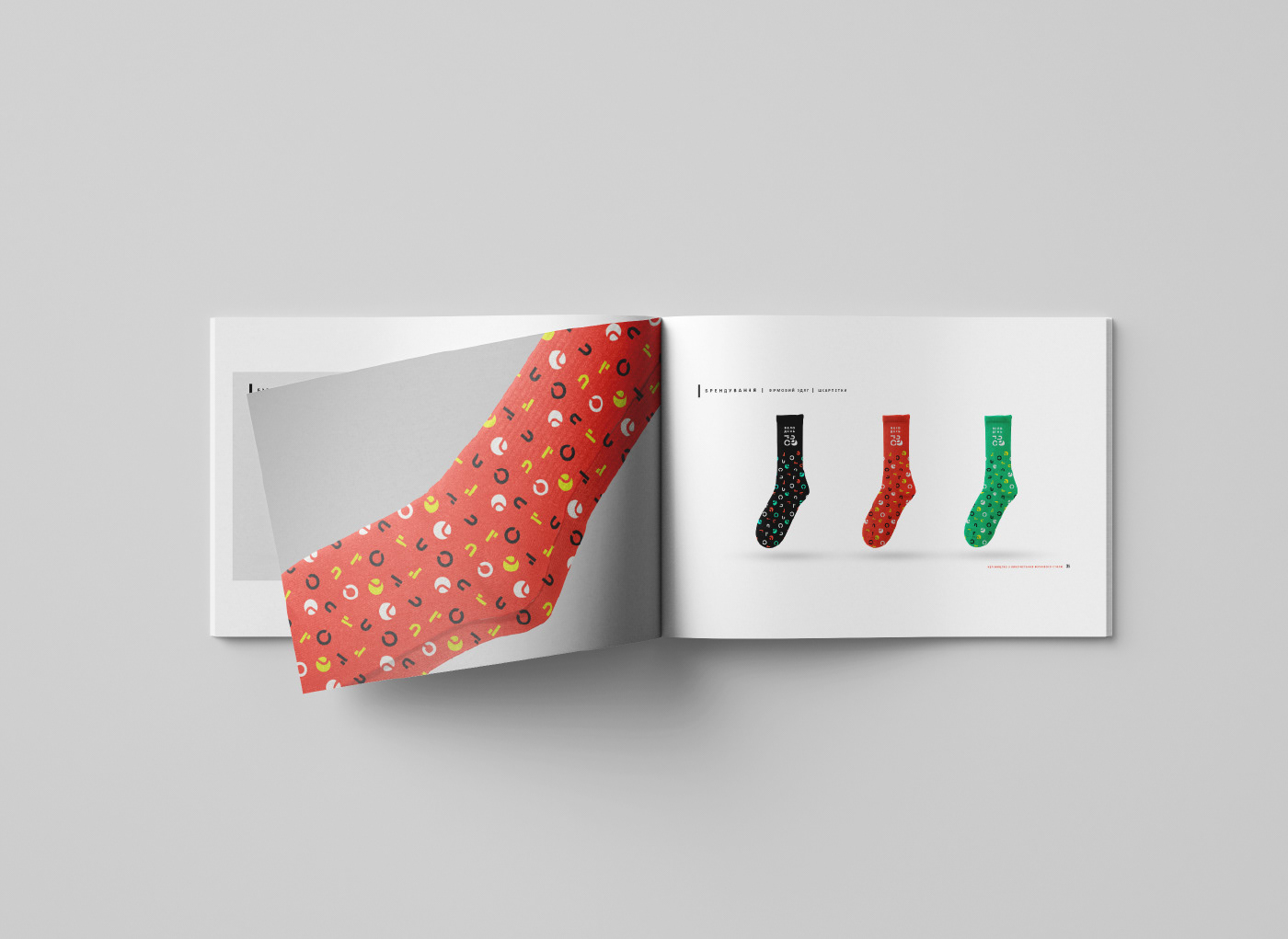
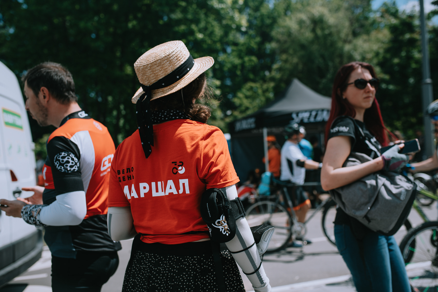
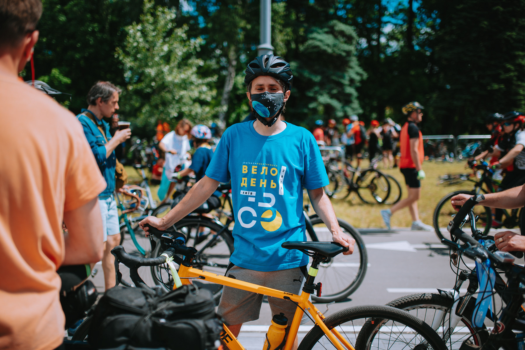
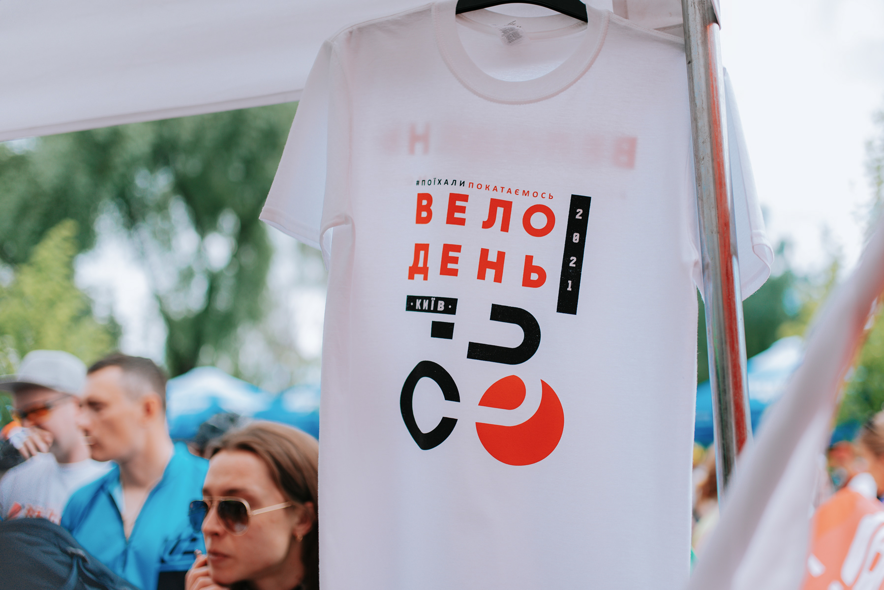
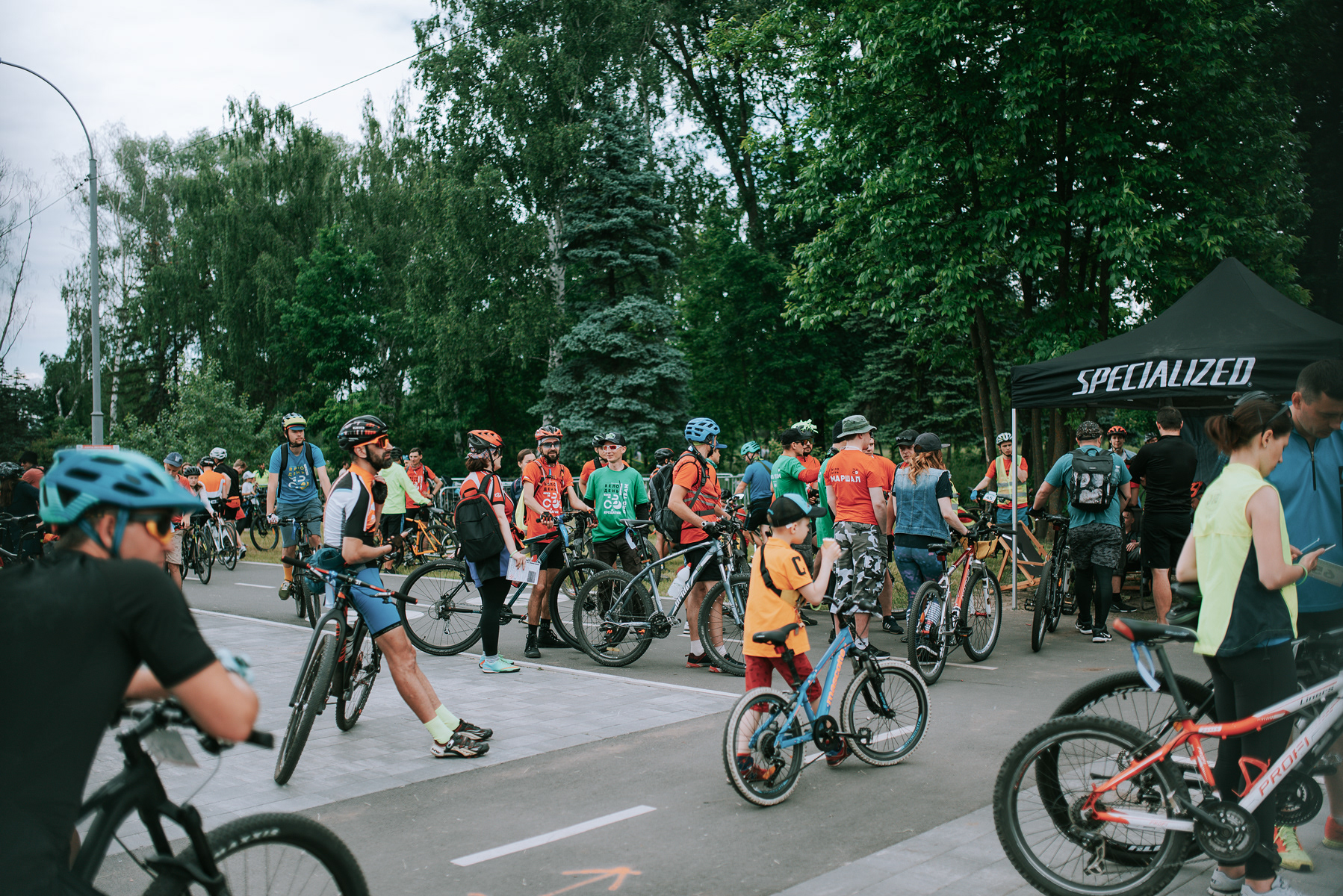
• festival merchandise (t-shirts for sale and for organizers, caps, socks)
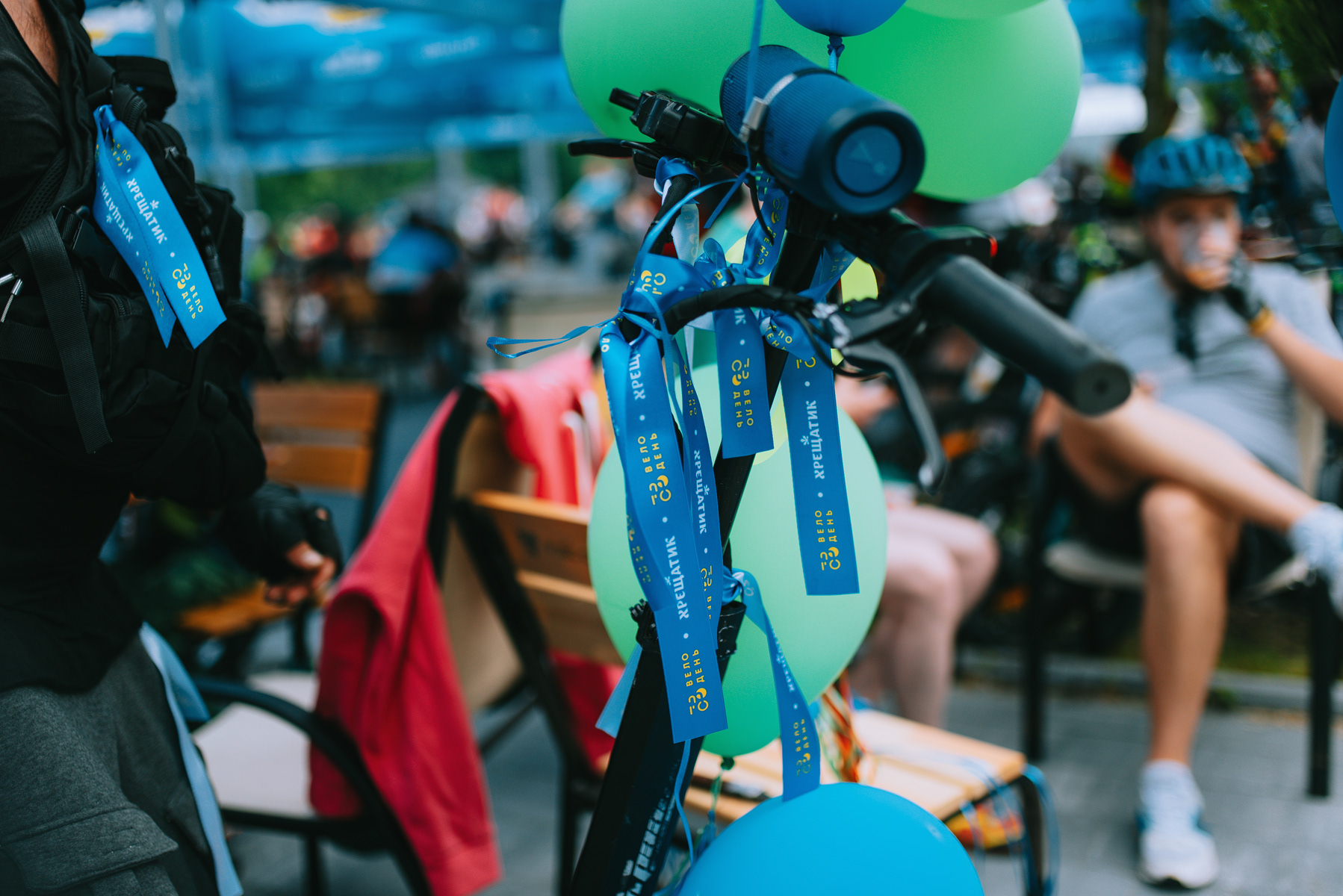
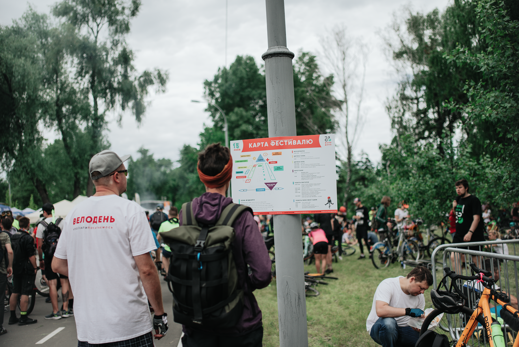
• on-site navigation elements such as participant numbers, wayfinding signs and the festival map.
In addition to the design work, I was responsible for coordinating the visual output of junior designers, ensuring consistency of the visual identity across all materials.
The result was a unified visual system that supported the festival both online and on site, creating a recognizable and coherent brand experience for participants and visitors.


Client: BIKEDAY